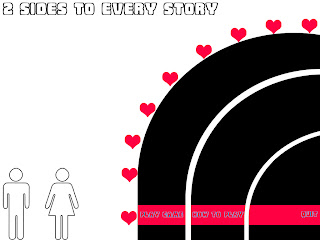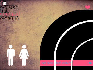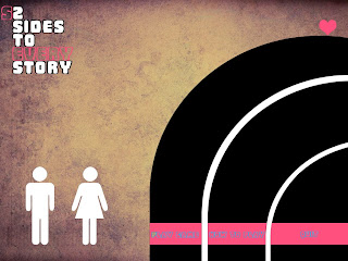


this was the first initial idea and i know the words are NOT straight this is a draft.
I just a little bit if help of which one looks or feels better.
As you can see that one has a texture so there is a different between the two images.
I would really appreciate some comments or criticism would be awesome XD
Fankooo very much
I have posted up some more things but because I saved them in my draft they have come up when I saved them if you get me so check them out if you pweeze
Cheers my dears...


2 and 4 i like muchly ^^ lol
ReplyDeletethe textured ones make what your saying more realistic and gritty... the hearts on 1 ... would look cool on them if you have to make it more interactive,have it look like its sliding down the side of 'arch'
http://vimeo.com/11661167
ReplyDeleteHERES THAT LINK XD FOR THE ICKLE DRY FISHES